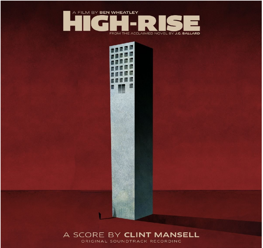
The team behind the film High-Rise have amplified the noise around their stylish movie and effortlessly created a content marketing hub on Tumblr – the site beloved of millenials. And they've created it in a way that educates, engages and enthuses. In lovely snackable chunks. I thought I'd share my thoughts on it, because if you need a content hub and can identify what to link to - then this is a brilliant blueprint.
The laser focus and broad remit of the High-Rise Tumblr is so simple and so perfect. They have concentrated on the disparate headline aspects that surround the film and investigated each one - mostly using curated (ie FREE) content. All held together by short and insightful features.
Those aspects (and that shared content) include the author of High-Rise J G Ballard:
There is focus on style and design (in their many guises) to echo the fact that film is a visually stylish offering.
Architecture, specifically Brutalism, features in the film and below is a header image they created for their own content and it's perfectly in keeping with everything else on the Tumblr. It's stylish, it's about architecture, it features a shot of a recognisable London landmark, it talks about the Balfron Tower that influenced Ballard. And they get their message across in under 100 words.
Themed headers for their own content.
Another focus is the film's star – Tom Hiddlestone, who – at the time of writing – is plastered all over the media. In fact there has to be praise here for the fact that they didn't turn the entire site into a Topless Tom Hiddleshrine (which is how half of Tumblr looks right now).
Tom Hiddleston in Time Out
After all of this amazing content curation and amplification they also cover the business of going to see the film.
They've added snackable, clickable quizzes.
And they let you know when there is merch to be bought.
They even add reviews. That is they share the community's reviews. And why not? This is a community site. It has more in common with a millenial's obssessive site: talking about and sharing everything that is their passion.
This is a great idea and, using a good art editor, it's created quickly.
This is a brilliant site - it knows its audience, it knows its product and it is SO simply done – although to be fair they have been working on it since before filming so it has been a labour of love - not just brute commercialism
I can't think of any creative launch that wouldn't benefit from a content hub that operates in the same way - one that encourages fans to be fans and educates lost souls who have wandered across from social media.


